netomat, France Tourism Canada team up on Social Media hashtag campaign, #FranceNature

By • Posted & filed under Blog Entries, News

For 7 glorious days, France Tourism Canada sent six bloggers to travel through different regions of France and to capture the natural beauty of these regions. The six regions traveled to were Provence, Occitania, Bordeaux and its surroundings, Auvergne & Lyon and its surroundings, Champagne – Burgundy and the Loire Valley. The bloggers shared their experiences and adventures on social media using the hashtag #FranceNature.

netomat powered the ‘Social media boards’ that aggregated all of the posts from the different bloggers across Twitter, Instagram and Facebook and displayed them on the tourism campaign website: http://ca.france.fr/en/francenature

Included in the campaign was a contest whereby contestants could enter to win 2 free tickets to France courtesy of France Tourism Canada, Rail Europe and Air France!

netomat powers France Tourism Canada’s Festive France campaign

By • Posted & filed under Blog Entries, News

netomat and France Tourism Canada partnered to power their exciting new Christmas tourism social media campaign called Festive France. The English and French language campaign tracked the adventures of three travel bloggers as they toured the Loire Valley, Provence, and Evian/French Alps and aggregated all of their social media posts from Twitter, Instagram and Facebook onto French and English versions of a website dedicated to this campaign. The social media campaigned was co-sponsored and supported by Air France, Rail Europe and Accor Hotels to drive travel to France this holiday season.

The websites can be seen here:

Festive France (English)
France Festive (French)

Festive France

netomat launches PixGL for iOS – Stunning Moving Photos with Motion Effects

By • Posted & filed under Blog Entries, News, Press Releases

netomat is proud to launch PixGL, its groundbreaking new Photo Effects application, in the iOS app store.

Moving Photos. PixGL v 1.0 is a simple new photo editing app for iOS that literally makes photos come to life. PixGL introduces Motion Effects, a new class of photo effects and filters which transform a single photo into a beautiful, continuously moving, video-like experience. These stunning Moving Photos stand out in an ocean of content and yet, can be produced at a tiny fraction of the time and cost of video.

Motion Effects were developed by renowned artist and software programmer, Maciej Wisniewski.

With Instagram-like simplicity, users can create and share a stunning PixGL Moving Photo or an entire album of Moving Photos in seconds. Users can also instantly share them across social networks or embed them in their blogs or web pages to tell captivating visual stories.

PixGL v1.0 introduces six FREE, elegantly simple new Motion Effects (light, mist, breeze, stardust, time-lapse and blend) that a user can apply to turn an ordinary still photo into a moving, video-like experience. Learn more at www.pixgl.com.

PixGL Mist motion effect

netomat, NYCGO team up for “Largest NYC Restaurant Week Ever”

By • Posted & filed under Blog Entries, News

NYCGO 2016 Winter Restaurant Week - MobileJanuary 15, 2016. netomat is proud to again be the mobile partner for New York City’s hugely popular NYC Restaurant Week campaign. In partnership with NYCGO.com, the official marketing, tourism and partnership organization for the City of New York, netomat has again built, launched and hosts the 2016 Winter Restaurant Week mobile web app.

According to a NYCGO.com press release, the Winter 2016 NYC Restaurant Week which runs from January 15, 2016 through February 5, 2016 is “The Largest NYC RESTAURANT WEEK® EVER.”

The press release goes on to say the following: “NYC & Company, New York City’s official destination marketing organization, encourages visitors and New Yorkers to dine out for NYC Restaurant Week Winter 2016 at one of the record-setting 371 participating restaurants throughout the City’s five boroughs starting Monday, January 18 through February 5. Now in its 24th year, the event offers three-course prix-fixe lunches for $25 and three-course prix-fixe dinners for $38 (excluding beverages, gratuities and taxes) Mondays through Fridays, with Saturdays excluded and Sundays optional. Diners can enter the #NYCRestaurantWeek photo contest on Instagram for a chance to win a $50 gift card to select NYC restaurants.”

netomat has been NYCGO.com’s mobile partner for eight years. During that time, netomat has designed, developed and hosted the beautiful NYCGO.com mobile website as well as dozens of mobile web campaigns including Restaurant Week, Broadway Week and Off-Broadway Week (all campaigns are registered trademarks of NYCGO.com).

NYC & Company (nycgo.com) is the official marketing, tourism and partnership organization for the City of New York, dedicated to maximizing travel and tourism opportunities throughout the five boroughs, building economic prosperity and spreading the positive image of New York City worldwide.

Winter 2016 NYC Restaurant Week

For additional information about NYC Restaurant Week Mobile or to partner with netomat for your website, mobile web, mobile application or social media campaign, please contact us info@netomat.net.

New Spotliter v1.2 for iOS 9 now available

By • Posted & filed under Blog Entries, News, photo and video, spotliter

Dear Spotliter fans – Happy New Year! Spotliter v1.2 has just been released to support iOS 9 and address issues in the app related to upgrading to the new version of iOS! So take and share lots of photos and videos with Spotliter’s unique and amazing photo and video Touch Effects on your iPhones. Check out some really cool screenshots of the Spotliter app below:

For more information, go to the Spotliter website!

Have a great 2016!
the Spotliter (and netomat) Team

Spotliter v1.2 with OVERLAY Touch Effect Spotliter v1.2 B&W2COLOR Touch Effect Spotliter v1.2 SKETCH touch effect

NYCGO Mad Men Dining Week – mobile powered by netomat!

By • Posted & filed under Blog Entries, News

Are you missing Mad Men? Well, you can now celebrate the show with a fabulous 2-course Lunch or two delicious cocktails at some great places in the city with NYCGO’s Mad Men Dining Week!. Check out the http://m.nycgo.com to see all the participating restaurants and bars, see the Mad men Dining Week menus and to make a reservation!

What a great way to discover a new hangout and for just $19.69?

Mad Men Dining Week mobile homepage

Why Non-Profits must get mobile-friendly

By • Posted & filed under Blog Entries

Let’s be blunt:  If your non-profit’s website isn’t mobile-friendly and you have no plans to make it mobile-friendly any time soon, you are making a strategic mistake and your piece of the fundraising pie will shrink.  Here are six big reasons why your non-profit must go mobile (view pdf version of this article):

1.  Mobile is where your users are

The worldwide growth of the mobile Web over the past couple of years has been stunning, propelled by the ubiquity of smartphones with large touch-enabled screens and excellent Web browsers.  According to a September 2014 report by StatCounter, “mobile usage in the US has grown by 73 percent over the last twelve months” and growing every day.  Nearly a quarter of all US internet traffic is now from mobile devices.  Furthermore, depending on the demographic your organization serves, those numbers may be vastly understated:

In January 2014, CNN reported that 40% of visits to CNN.com in 2013 came from mobile devices.  This announcement came shortly after ESPN, the BBC and Buzzfeed all announced that mobile traffic had matched or even exceeded desktop Web traffic at times in 2013.  Note that these numbers are already a year old at this point and ESPN.com recently announced that 55% of its unique users came from mobile devices in September 2014.

2. Mobile internet use exploding among minorities

In the US, minorities are increasingly accessing the internet on their mobile devices to access information, for advocacy and for civic engagement.  While studies have shown that minorities have trailed whites in terms of home broadband adoption, this trend does not hold true for mobile devices.  According to a 2013 Pew Research study, 67% of Hispanics and 72% of black users used cell phones to access the Internet compared to 56% of white users.  A May 2014 report by Experian also found that “among smartphone owners, Hispanics are 17 percent more likely than non-Hispanics to say that they access the Internet more through their phone than through a computer. In fact, 45 percent of Hispanic smartphone owners are mobile-dominant when it comes to going online compared with 38 percent of non-Hispanics.”

Another recent survey by MyWireless.org found that “the number of Asian-Americans who say they have used their wireless phone for civic engagement or advocacy nearly doubled from 2012 to 2013” and also that “the majority of 18-29 year old Asian-Americans surveyed now say they have used their wireless phone for civic engagement and advocacy.”

3. It’s a worldwide phenomenon

The adoption of the mobile Web is a worldwide phenomenon and in both developed and developing countries.  In many developing countries, the majority of internet users use only mobile devices because of limited access to PCs or the wired Internet.  For example, surveys have shown that 70% of internet users in Egypt use only mobile devices to access the internet.  In India and South Africa, those numbers are 59% and 57% respectively.

4. Your emails and social media posts are being viewed on a mobile device

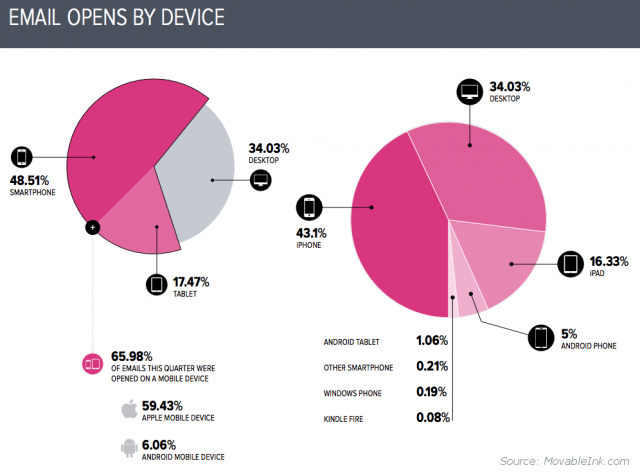
It’s vital to recognize that all outreach to the community you serve, whether marketing, education, fund-raising or support-related, should be accessible on desktop and mobile devices.  Mobile-enabling your website is critical but the initial point of outreach such as an email must also be mobile-friendly because one out of two emails are being opened on a mobile phone.

Mobile Email Open Rates

You are asking users to not only spend their precious time to read your email but to also take further action to donate their money, time or attention.  So remove the obstacles in their way.  Make it easy for them to read your emails, regardless of what device they use.  Make it easy for them to act on the information they just received.  Otherwise, there is a very real and very large cost to you:  A Google report found that as many as 61% of Internet users will leave when they visit a site that is not mobile friendly.

Similarly, if you are trying to connect with users via Facebook or Twitter or other social media, your posts are likely being viewed on mobile devices.  Research firm Sandvine recently reported that one-fifth of all data used on mobile phones is from Facebook and a Q3 2014 report by Simply Measured found that “80 percent of Twitter’s active users are on mobile.”  When these users click through to your website, they will expect a mobile-friendly experience.

Which brings us to the next, and perhaps most important, point:  Make it easy for users to give.

5. Mobile giving is here.  Now.

As Generation X and Generation Y users start to represent larger percentages of online users, they are also becoming a bigger part of online giving.  An August 2013 study by Blackbaud found that “nearly two-thirds (62 percent) of Gen Y and nearly half (47%) of Gen X say they would consider giving via a mobile device.” Yet an online fundraising scorecard report conducted around the same time found that “84% of nonprofits’ donation landing pages were not optimized for mobile.”  This chasm between what online users expect and what is being delivered represents a huge missed opportunity in fundraising.  Conversely, organizations that have invested in enabling mobile donations have not only seen significant uptake but have also seen that mobile can both encourage and facilitate impulse giving.

Mobile giving has recently been made much easier by payment processing companies, Apple Pay being the most recent high profile example.  Ebay UK reported that over 66% of Paypal donations for BBC’s Children in Need charity came from mobile.  Similarly, Penny Pritzker, the U.S. Secretary of Commerce, noted in a blog post that “the number of PayPal mobile donations [for the annual #GivingTuesday event] jumped nearly fivefold over the previous year, and the value of those donations increased more than 200 percent.  These are numbers non-profits cannot afford to ignore.

6. Your website needs to be touch-friendly

Even if your site looks ‘ok’ or ‘readable’ on mobile browsers, it probably isn’t easy to navigate on a touchscreen.  Mobile design is sometimes misunderstood to mean ‘design for smaller screens’.  However, in 2014, an effective mobile design means designing interfaces for all touch screens that work in obvious and predictable ways:  Touch targets such as menu items, buttons and links should be large enough and with enough space between them to avoid accidental taps; swiping should be implemented in a way that is clear to users and does not interfere with native browser functionality.

In addition to the 260 million plus tablets expected to ship in 2014, more and more laptops are currently being sold with touch screens, including Windows 8 devices and Chromebooks, in many different shapes and sizes.  One global PC maker, Acer, announced in 2013 that 50% of the notebooks it ships in 2014 will have touchscreens.  An 11″ touchscreen notebook user may find the tablet version of a website more appealing than a classic desktop website. For many children, tapping on the screen of a phone, tablet or small notebook is the first way they learn to interact with computers. Kiosks and other devices benefit from touch-optimized design as well. Users are already trying to tap on desktop websites, and touchscreen ubiquity is coming.  We expect touchscreen users to become the majority of web users in the near future.

Making your website mobile-friendly

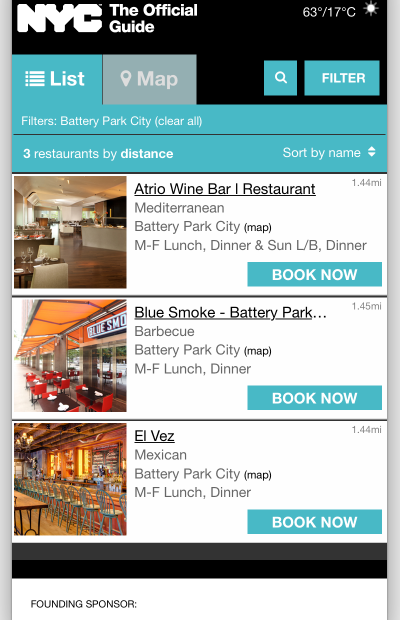
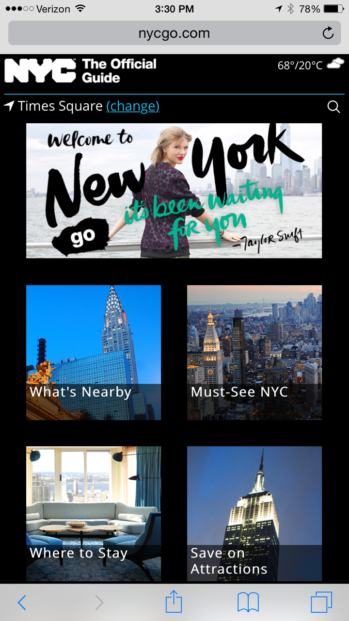
With recent advancements in Web technology, there are different options for how websites can be made mobile friendly.  One option is to develop a dedicated mobile website that is separate from the desktop site to which the mobile user is automatically redirected.  Another option is to redesign your existing website to use Responsive Design which detects that the device being used to visit the site is a mobile device and dynamically reformats the presentation of your web page to be mobile-friendly.  Each option has its benefits and the decision on which one to choose depend greatly on your organization’s specific needs and constraints.

We at netomat, Inc. can answer your questions and help you make the right decision.  We build beautiful websites, apps and social media services that work seamlessly across desktop, tablet and mobile devices.  Our team averages over a decade of experience in mobile, web and social.  We work with clients both large and small, tailoring solutions to fit their specific needs and budget.  Contact us at info@netomat.net and let us help you.


NYCGO.com announces Taylor Swift as New York City’s global welcome ambassador

By • Posted & filed under Blog Entries

NYCGO.com, the official tourism organization for New York City (the greatest city in the world! – not that we are biased or anything…) announced that Taylor Swift will be its official global welcome ambassador.

Learn more by visiting the netomat-powered NYCGO.com mobile website  on your phone!


Taylor Swift welcomes you to New York City

netomat partners with Atout France, France’s Official Tourism Development Agency, on social media campaign

By • Posted & filed under Blog Entries, Press Releases

New York, July 17, 2014

Atout France USA, France’s official tourism development and promotion agency in the USA, partnered with netomat to develop a fun social media campaign across web, tablet and mobile that followed several well-known travel bloggers as they journeyed through some of the most beautiful and culturally-rich cities in northern and southern France. The campaign, #TopFrenchCities, followed the bloggers or “travel ambassadors” as they visited Reims, Dijon and Poitiers in the North of France and Nice, Aix-en-Provence and Marseille in the South of France.

The campaign tracked and aggregated the travel ambassadors’ social media posts, beautiful photographs and amazing videos from Twitter, Instagram, Facebook and Google+ on the campaign website using the #TopFrenchCities campaign hashtag and city-specific campaign hashtags.

netomat was responsible for all design, development, integration, and ongoing hosting and management of this exciting, responsive design-based campaign. For more information, please contact sales@netomat.net.
netomat Social Media Board - Top French Cities

Fast Company interviews netomat CEO, Kris Ramanathan, about iOS 8

By • Posted & filed under News, photo and video, spotliter

Four Major Headaches Apple Fixed Shows It’s Listening To Complaints For Once

When Tim Cook took to the stage at WWDC this week you could tell something was different. Usually the keynote is dedicated to showcasing all the front-end, user-centric features of the next iOS and OS X, with the new developer tools taking a backseat at private labs during the week. But this time Cook revealed that a full third of the keynote would be dedicated to showcasing the greatest features of the iOS 8 SDK–something Cook boasted was the “biggest release since the launch of the App Store.”

It turns out that wasn’t just hyperbole. As WWDC winds to a close here are what developers told us are four of the massive changes to the iOS SDK that will make coding for it better than ever. What’s most surprising? In an uncharacteristically sympathetic way for Apple, they seem correspond to the most prevalent developer complaints. Read more